Often times when I tell people I’m writing this blog, I want to give them something with the website on it so they’ll look at it when they’re home in front of a computer (preferably with lots of time so they can peruse back through all of my posts).
The obvious answer for this is a business card- right? I mean, that’s the socially acceptable way to hand people your contact info…so I’ve been thinking for a long time about what kind of business cards I wanted that would be unique and interesting and memorable. I thought about ordering some or using a photo service to make a visual business card.
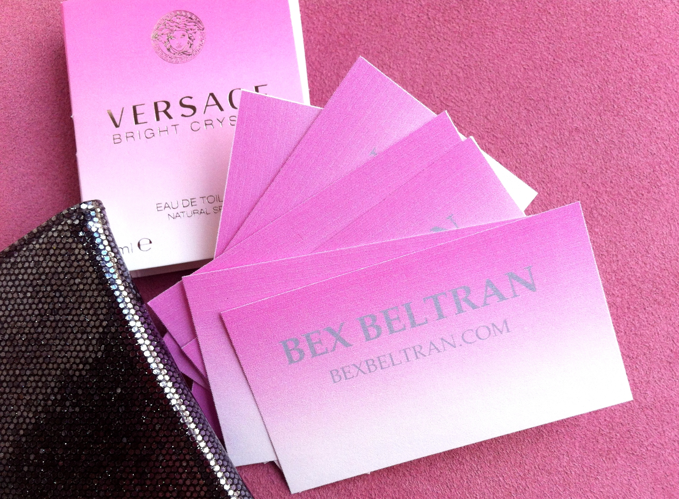
Well, wouldn’t you know.. perfume sample inspiration struck again! I was looking at this Versace Bright Crystal sample and adoring the pink ombre effect, wondering how I could use the effect in something for myself.

I really love the how the little sample tube on the inside is pink instead of white or clear like many perfume samples are. And I’m so impressed that the flower types are included too! I want to get better at recognizing specific flower scents and being able to accurately describe what something smells like.
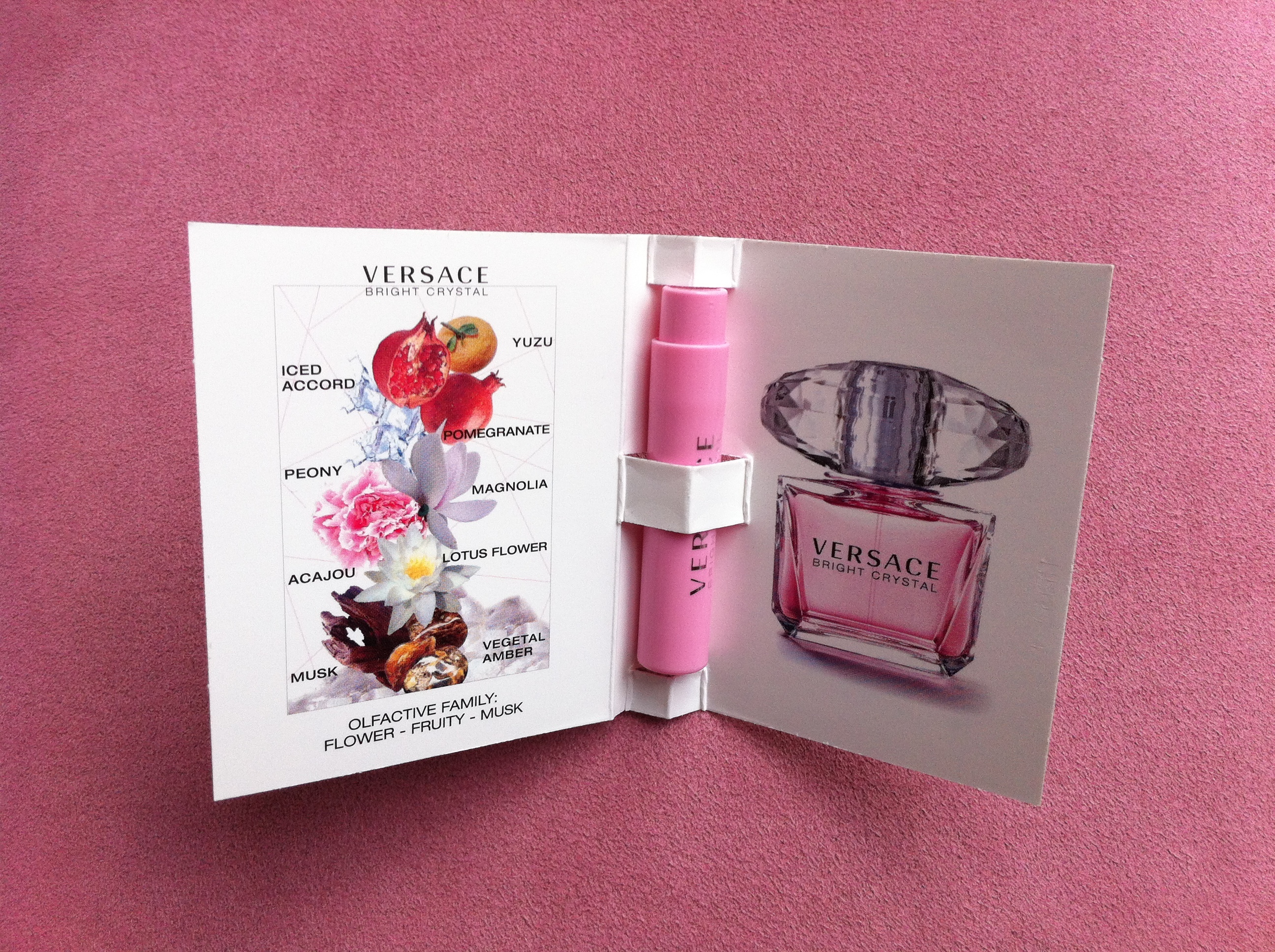
As I was admiring this beautiful little card, I thought- “why not?! I could recreate this look on a business card!”
I remembered that I had some leftover blank DIY business cards in my paper stash.

I opened up my trusty Word on my little computer and went to work.

These were amazingly simple to make and I think they have a huge visual impact! Those people at Versace really know what they’re doing! (Don’t you love the sparkly little business card case I already had to hold them?)
I was in love with my new creation- but even still, I wondered what could I do to really give them that finished, polished look?
Meet my new favorite tool! I was coveting this corner rounder for a while, and once I got it, every scrap of paper on or around my desk suddenly got a rounded corner makeover!

At first, I planned to leave half of them with a straight edge and half with the rounded edges to let you all vote to help me decide… but, as you probably guessed, I just couldn’t stop.

I loved the effect and didn’t think it would be fair to let some of the cards become rounded while leaving the others with boring square corners – still vote to tell me which you prefer- I have the rest of the blank cards ready to print! I can always make more!
If you run into me in person, remind me to give you one of my cards.. I’m sure they’ll be collector’s items someday in the near future!
Thanks for reading! Have a great weekend!

looks fabu! A concern though- if the person forgets (horrors!) to look right away – a little more info might be appropriate- like it’s a blog about creating or something along that line. I am very jealous of your corner rounder as I have one from the distant decades & yours seems much easier to implement. Good job on having a tactile presence for your blog. Yay!
good news! the back is totally blank- so when I make my second batch, I can add more details there.. like my tagline- or top rated projects- or whatever!
cool!
Love them!
Love this! I can’t believe you created that ombre effect in word! Any pointers on how to achieve that look?? I’m thinking it would make a cute Christmas card. I need a tutorial!! Thanks!
Kristen
sure, it’s pretty easy. To get the ombre look, I used the shape feature (instead of the table feature) in word to make the card rectangular shapes, then I changed the fill color by selecting gradient, and then light variations. Let me know how it goes for you.
That sounds easy! I will have to give this a try. Thanks!!
Pingback: Magnetic Attraction | bex beltran
Pingback: Matchbook Style Business Cards | bex beltran